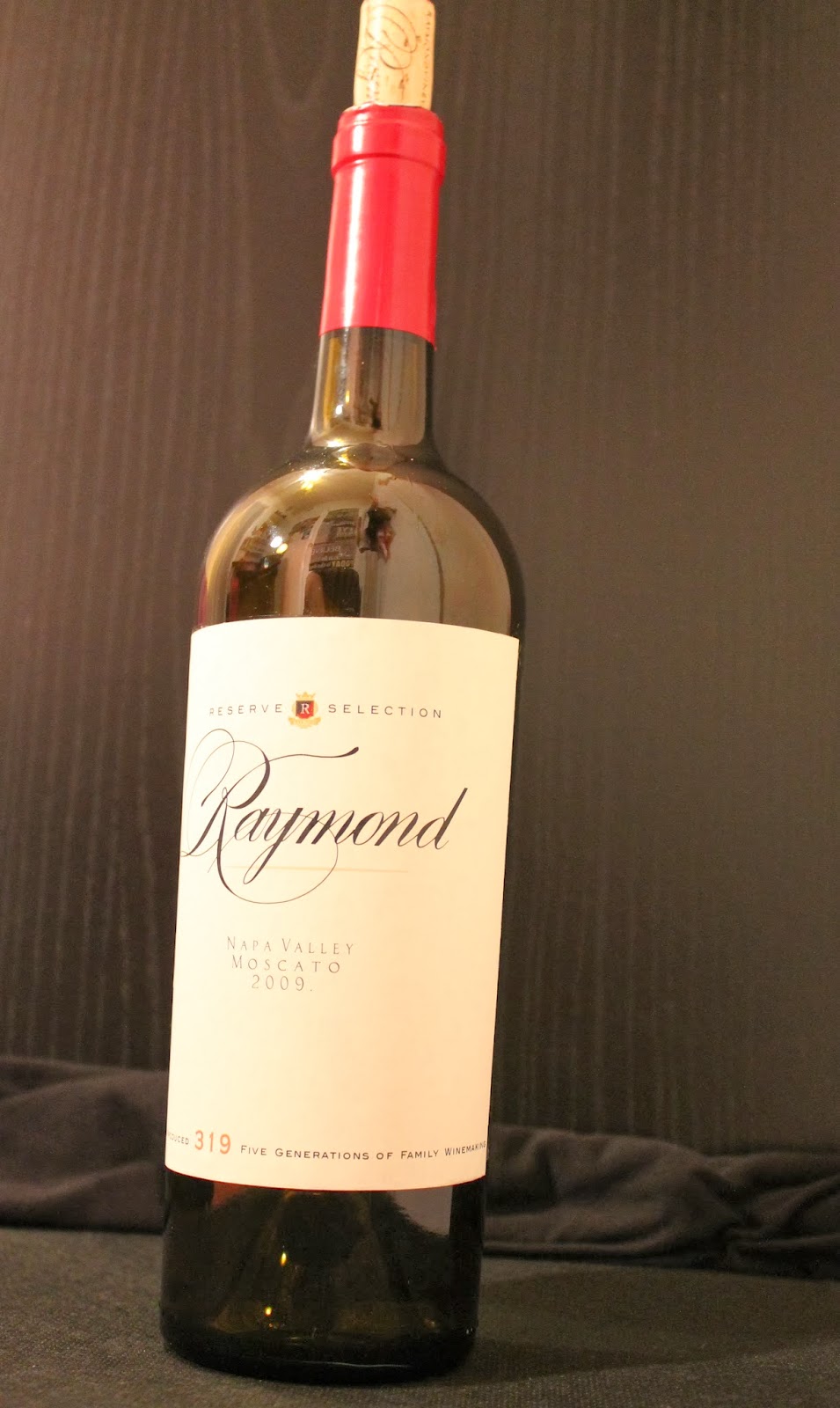
Everything is re-packaged and all set!
The image on the left is the original, while the one on the right and the subsequent images are my recreation as well as repackaging. Tracing the script font was a challenge to start with. Once I was able to get a rhythm going, however, it went smoothly. I tried in the beginning to widen the lines as I went. I got to essentially the last little bit on the "R" and went to widen one of the curves and it threw EVERYTHING off. At that point it was just easier to go back in and start fresh. This time I just outlined everything and then went back in and changed the width of each line. This second go around took much less time now that I knew what I was doing.
I changed the flavor of my design to a Moscato. It's a sweeter wine and so I went with a peachy, more fruity color for the underline as well as the "319" at the bottom.
To find the text for the "Reserve Selection" and the "319" and the subsequent text along the bottom, I just sifted through most of the fonts already installed in the Adobe library. The text for the "Napa Valley" section was found by using whatthefont.com. I cropped this portion out of the original label and uploaded it to the site. Once the site gave me its suggestions I went with the best match that it suggested.
For my images I glued my new label onto the bottle, unfortunately as the bottle sat over the weekend the glue has started to warp the paper. The label still looks nice, but now just has a few bubbles that I can't work out. Other than that, I'm extremely happy with the way that my version came out.